Beyond Cream City Brick Part Five
A Postwar Vision for a Modern Milwaukee
In the years immediately following World War II, there was a concerted effort in Milwaukee to construct new arts, sports, and cultural facilities. These projects were promoted by city and county politicians, business leaders, and civic groups as amenities to serve local residents and showpieces to elevate Milwaukee’s status as a major city. All played a role in cultivating Milwaukee’s identity, and some even made a significant contribution to the city’s architectural heritage. The three buildings discussed below continue to serve in their original capacities and are some of the city’s most visible symbols of the Modern Movement.
Milwaukee Arena (Now UW-Milwaukee Panther Arena)
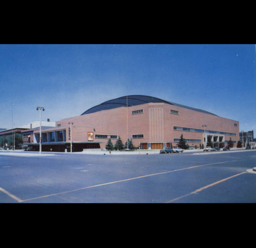
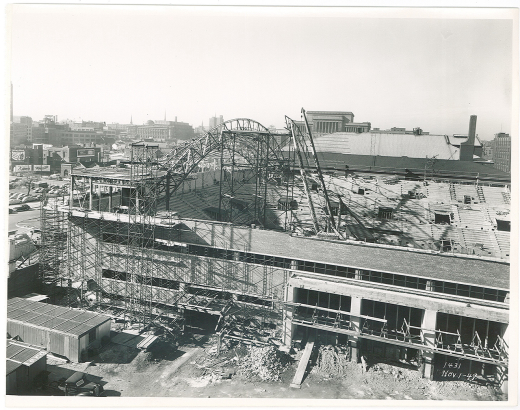
In an age where new arenas are regularly built for hundreds of millions of dollars and “old” ones don’t seem to last more than 30 years, it’s not often that in a major city you’ll find a postwar arena that retains much of its integrity and maintains its relevance with the community. Which makes the Milwaukee Arena, first opened in 1950 at a cost of around $5M, all the more interesting. Five years earlier, Milwaukee’s civic leaders were gauging the public’s interest in building a new venue for the growing city that would serve as a larger counterpart to the old Milwaukee Auditorium and become the primary indoor gathering place for conventions, exhibitions, and athletic events.
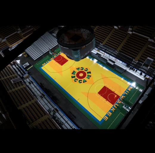
While the building appears quite modest by today’s standards, its beauty lies in its simplicity and practicality, fully embracing the modernist ethic of “less is more.” It was designed by one of the city’s most celebrated firms, Eschweiler & Eschweiler, and much thought was given to movement, wayfinding, and the overall user experience. At the time, it was notable that there were no interior posts blocking views, large banks of doors on all sides allowed for rapid exit, and restrooms were prevalent. The main lobby was also praised for its spaciousness, its wall of “nearly all glass,” and its semicircular ticket office which featured windows angled in seven directions in order to reduce crowding. Visual queues also aided patrons as they moved through the building. The stairs leading from the lobby up to the main concourse were colored in an alternating pattern of red and green to increase visibility, and the tickets were printed on a background of maroon, blue, or tan to make it easier for the patron to find their seat of the corresponding color in one of the three tiers. In 1978, the Arena became home to a groundbreaking work of pop art in the form of a basketball court designed by Robert Indiana, painted in bold colors inspired by the building’s interior and featuring giant ‘M’s on either end of the court.
In order to cut costs on the building, decisions were made to clad the majority of the exterior with brick instead of Indiana limestone and to substitute a copper-clad roof with composite. Hidden behind its unadorned exterior is a sense of post-war optimism and civic pride that was swelling at the time of its opening. As stated in an Op Ed by then-Mayor Frank Zeidler upon completion of the building: “The Arena is a symbol of the life of the people of Milwaukee. Its brick and mortar, its steel ribs, its decorative features, remind us how the bonding of many qualities can create a building of great beauty.”
