Soft-selling Aluminum: Minoru Yamasaki’s Reynolds Metals Sales headquarters

Author

Grace Ong-Yan, Ph.D.

Affiliation

IE School of Architecture & Design

Tags

Newsletter, corporate modernism
Image details

The Reynolds Metals Company capitalized on the persuasive power of aluminum, by re-inventing it in such popular post-war campaigns as “The House of Ease,” and “Do-It-Yourself!” [1] After serving as a key material for World War II aircraft frames and ship infrastructures, Reynolds Metals aluminum was re-cast from military to domestic use. Aluminum’s versatility enabled it to take on a multitude of colors, forms, textures, and effects. These qualities made it, in the words of David Reynolds, company vice president in charge of sales, “the greatest salesman of all.”[2] 


In 1945, the company pioneered aluminum siding for homes and buildings and in 1947, created what would become its hallmark product, Reynolds Wrap. With Reynolds Wrap, the corporation discovered aluminum’s best use in its as wrapping potential. As we will see in this essay, wrapping would extend to architecture, as a literal metaphor for the separation of form from structure, thus signaling a re-evaluation of modernism. As a non-structural architectural material, aluminum offered communicative properties of symbolism and expression. This essay will discuss the Reynolds Metals regional headquarters as a “new formalist” expression, which evolved beyond corporate modernism.


By the mid-1950s, Reynolds Metals’ Company had launched an advertising campaign directed at a new target— the building industry.  The campaign included the commissioning of Aluminum in Modern Architecture, a 1956 two-volume book that highlighted 100 examples of aluminum in building since World War II.  In it were conversations about the potential of aluminum use in modern architecture with a long list of influential architects including Mies van der Rohe, Walter Gropius, and Frank Lloyd Wright. Commissioning an architectural showcase for aluminum would be the next step in Reynolds’ ambitious post-war business plan. 


In 1956, Reynolds hired Troy, Michigan-based architect, Minoru Yamasaki to design their regional sales headquarters in Southfield, a suburb of Detroit. The site selection was strategic, as the client sought close proximity to “the technological center of the country,” where the headquarters of General Motors, Ford and Chrysler were located. While Reynolds marketed aluminum to the building industry, they also directed their interests at the booming automobile industry. Aluminum producers in the mid-1950s had supplied the auto industry with only small parts, but they had long hoped to capture a larger share of Detroit’s big-volume metals business.  Reynolds’ strategy was to thrust aluminum into the view of Detroit automakers with a new regional headquarters building.

The site’s clear visibility from all directions positioned the headquarters perfectly for what Reynolds hired Yamasaki to design: a “dramatization of aluminum.” Yamasaki explained that he and his clients envisioned, “a building which could be seen from all sides [that] could better bring attention to aluminum than one which was crowded between others." Yamasaki was charged by his client, “to produce a building that would focus the attention of the people, particularly the automobile designers, in the Detroit area on aluminum.”[3]


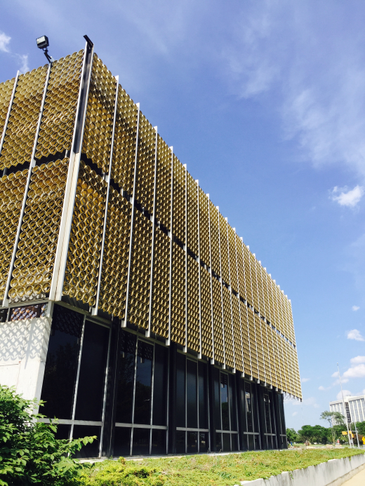
When it was completed in 1959, Yamasaki’s Reynolds Metals headquarters was a glittering “jewel on stilts,” comprised of a spectacular gold aluminum screen that wrapped a three-story glass rectangular box. (Fig. 1) The glass building was raised on slender pilotis, set on a white polished terrazzo podium, raised one foot, three inches above grade. A shallow reflecting pool filled with water lilies surrounded the podium. The building’s ground level glass enclosure offered clear transparency from the exterior through the interior space. Spatially, the building was organized around a central interior court, crowned by a tetrahedral-faceted and aluminum-trussed skylight.[4] Fabricated as a space frame of bright aluminum rods and spheres, the skylight was lit up at night like a beacon on the roof at by ninety-one 150-watt flood-lights. The building, signaled by the illuminated skylight, was visible from the nearby highway and beyond.


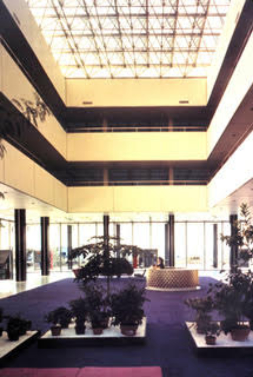
 Interior design firm, W.B. Ford Design Associates sought to harmonize the interior elements of the building with the shimmering gold of the exterior sun screen.  The lobby’s free plan was designed to display aluminum objects at the scale of an automobile or a boat, as well as smaller items. A plush, royal purple carpet, 30 feet by 60 feet, defined the central space underneath the skylight. (Fig. 2) The focal point of the lobby was an aluminum reception desk was designed by artist and furniture designer, D. Lee Du Sell.  At eight feet in diameter and faced with a sculptural screen composed of extruded aluminum elements, the desk design integrated both bright dipped and gold-anodized aluminum.  In November 1959, Interiors magazine described the space in the following terms. 


“Entering the building is truly like entering a cut jewel; the interior has that air of fantasy, that ambient, changing omnipresence of light, that sense of infinitely expanding, multi-faceted space.  The interior space of the ground floor, unbroken except for elevators and stairs in two tiny areas, glows with light through the complex formation of pyramid-shaped skylights, and through visually nonexistent glass walls.  The elegant black columns make a dancing sensation of space, pacing forward and back, inside and out, in precise contrast to the hazy flow of the landscape outdoors.  Upper floors hover in tiers, leaving the central chamber a vast, rising space.”[5]


The two upper floors of the headquarters housed flexibly partitioned offices and conference rooms, forming rings around the central atrium space. In addition to the exterior sunscreen and skylights, numerous interior elements and furniture employed aluminum, including desks and special built-in wardrobe, display, and storage units in executive offices. The luminous ceiling was divided by aluminum T-bars, containing fluorescent tubes shielded by a small-scale honeycomb of aluminum painted white.


To be sure, Yamasaki’s design displayed his modernist allegiance—it was fundamentally a modified Miesian glass box on stilts. Yet the flamboyant aluminum screen and otherworldly atmosphere signaled a turn away from functionalism. Minoru Yamasaki was an architect of the second generation of modernists whose work was marked by a serious re-evaluation of modernist principles through exploring concepts of history and ornament in his architecture. Critics, like Douglas Haskell and Thomas Creighton, editors of Progressive Architecture and Architectural Forum, respectively, defined the 1950’s and 60’s “new formalism” movement, as it became coined, as “a mix of intuition and sculptural freedom,” and the result of “a popular demand for more decorativeness and romance.” The improvisation of the “new formalism,” was clearly emerging in the Reynolds commission, with its symmetry, and its ornamental, yet functional, aluminum sunscreen.


Yamasaki’s 45,000 square foot showcase for aluminum was theatrical, and meticulously crafted. But the building was more than a sales tool, it was early example of architectural branding, defined by a synthesized environment employing aluminum in many design scales. Aluminum was purposefully used throughout the headquarters design, from the spectacular sunscreen that hung around the building, to the custom-designed aluminum furniture, office partitions, and lighting fixtures. In this way, the Reynolds Metals building is a total work of art, and represents the pinnacle of how architecture serves as branding. The highlight of the aluminum applications was Yamasaki’s design for an elaborate aluminum sunscreen design that was a literal display of the company product.  Analysis of the sunscreen offers insight into its role as modern ornament and the evolution of modernism.

Sunscreen: functional and symbolic


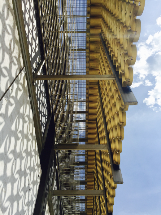
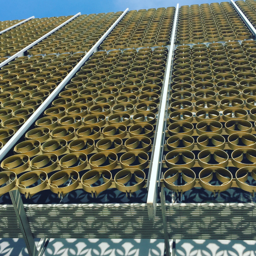
Yamasaki took the task of dramatizing aluminum[6] seriously, and his grand gesture was a gold anodized aluminum sunscreen wrapped around the building’s upper two floors. (Fig. 3 & 4) Sunscreens were the modern architect’s challenge to modernism. While screens served a functional purpose in blocking harsh sun rays, they could also be considered as a kind of modern ornament, as form separated from structure. While the absence of ornament was an established principle of modern architecture, ornament continued to be a contested issue throughout the epoch. For example, Mies van der Rohe’s non-structural I-beams embellished the Seagram building’s facades in a similar kind of “modern” ornament. Le Corbusier had also explored sunscreens in the form of concrete brise-soleil in many of his projects including Cité de Refuge, the Secretariat building at Chandigarh, and Unité d’Habitation. 


The sunscreen or “grille,” as Yamasaki called it, consisted of ten-and-a half-inch diameter rings, two-and-a-half inches deep, locked together into two rows of panels at 12 feet by 5 feet. The panels are divided by vertical runners of aluminum set at the building’s 5-foot module points. To block the rays of the sun until they reached a very low angle, the sunscreen rings were fourteen inches deep above seven feet and two-and-a-half inches deep below seven feet.  The grille was hung five feet from the building on aluminum tubes, which were anchored into the concrete floor slabs.


Yamasaki designed the extruded aluminum to be cut in the sectional direction, Then, the cut extrusions were overlapped and fused in a repeated pattern.  This created a “de-materialized” effect and gave texture to the layered facade.  Yamasaki explained that the “surfaces develop from the fact that in me the urge to touch the buildings is strong…sometimes irresistible.”[7]  For Yamasaki, the “desire to touch architecture,”[8] was essential. Others experienced the subtleties of the Reynolds sunscreen as well. When the building opened in 1959, a vivid description of the dynamic sunscreen appeared in Architectural Forum


“As the observer moves around the building, the vertical runners on the screen’s surface seem to flicker past the heavier pattern of the structural frame behind them.  Close up, the tracery shadows dance on polished terrazzo floors or bounce back from the reflecting water in the pool.  The risk is that over the long run the filigree may be regarded as too pretty; but, it arrestingly soft-sells aluminum.”[9]


It was just this kind of “soft-selling” that defines branding.  Branding is not an aggressive sales pitch, but makes and maintains an emotional connection with the consumer and consistently delivers that emotion. The varied textured of the surfaces—the sunscreen, the reflecting pool, the polished terrazzo— provided delight and appeal to the senses, providing “delight” to all who visited the building.


The Reynolds Metals regional sales headquarters was the result of a corporate client who sought to build a showcase for aluminum and an architect who questioned modernism.  The result was a “total work of art” of architectural branding, and an important example of “new formalism” that would be a travesty to lose.  This important building in the history of modern architecture is dangerously close to a devastating outcome. 

Reynolds Metals Building Today


In 1984, the Reynolds Metals building was purchased by Vic Tanny Health Clubs, an owner who was not committed to the architecture’s preservation. Today, the aluminum sunscreen and skylights are still intact, but the interior has been altered to deleterious effect.  The walls of ground floor were extended to the perimeter, a swimming pool was installed in the basement, reflecting ponds were filled in, and a running track installed on the third floor. Currently, the building sits vacant, on the market.  I had the opportunity to visit the building during the 2016 DocomomoUS Annual symposium, and while I was delighted to see the brilliant aluminum sunscreens in person, I was saddened by the abandoned and terribly altered state of the building.


Without the right client, this important example of corporate modernism could be demolished.  With the right client and careful restoration, the Reynolds Metals building could thrive once again and into the future. The building’s future could easily be envisioned as part of a global network of workspaces, like WeWork, a company that transforms buildings into dynamic environments for creativity and collaboration.  An excellent model for the Reynolds Metals building is Bell Labs’ recent reincarnation of Eero Saarinen’s 1956 headquarters building for the corporation in Holmden, New Jersey as a flexible work space. It both preserves the architecture design, and enables the building to be a vibrant part of in today’s economy and lifestyle.


About the Author

Grace Ong Yan is an architectural scholar and educator, who teaches at IE University in Segovia, Spain. Her research focuses on American and European modernism, with a particular interest in corporate modernism and how architecture serves as branding. Her forthcoming book examines corporate modernism as architectural branding strategies for corporate clients. Her published works include Architect: In the Words of the Pritzker Prize Laureates (Blackdog & Levanthal, 2010), and contributing essays in A Companion to Twentieth Century Architecture (Wiley-Blackwell, 2017) and Design and Culture (Bloomsbury (formerly Berg), November 2012). Grace has practiced architecture in a number of American and European firms including Renzo Piano Building Workshop, Robert A.M. Stern Architects, Pei Cobb Freed and Partners, Gensler, and Rafael Viñoly Architects.  She is the currently chapter president of DocomomoUS-Greater Philadelphia.  She received a B.Arch. from the University of Texas at Austin, a M.Arch. from Yale University, and a Ph.D. from the University of Pennsylvania. 


Notes

[1] “The House of Ease was not one standard House but a package of 20 to 30 aluminum products—including the roof, windows, insulation and ductwork—which can be adapted to houses of any style or price range.  They save the owner as much as $6,000 in maintenance costs over the life of a 30-year mortgage.” “We tested the idea in five other cities last year.  Success was overwhelming.  An average of seven out of ten home buyers chose the aluminum house. “Do-It-Yourself!” was another late-1950s Reynolds Metals Company marketing campaign in which a “complete ladies wardrobe using aluminum yarn fabrics has just been designed by Vogue Pattern Service.” David P. Reynolds, Press Release, September 15, 1959. VHS and 1958 Press Clippings, The House of Ease,” Reynolds Metals Company Papers, Virginia Historical Society. 

[2] “Reynolds Sales Head Tells of Company’s merchandising campaigns,” April 28, 1954. Press Release, Public Relations Department, 2500 S. Third St. Louisville, Kentucky. David Reynolds File, Reynolds Metals Company Papers, Virginia Historical Society. 

[3] This comment was edited out of the published account of the building in Yamasaki’s A Life in Architecture (1979).  The complete writing by Yamasaki is found in this type-written draft.  Minoru Yamasaki, Typed draft of A Life in Architecture, Yamasaki Collection, Syracuse University, Special Collections Research Center 

[4]“The Reynolds Metals Buildings in Detroit: Sales Headquarters Building for the Great Lakes Region,” in Architectural Forum, November 1959, v. 111, 140-145. 

[5] “Reynolds Metals Building, Detroit: Yamasaki’s delectable jewel on stilts,” Interiors, November 1959, #119, 104.

[6] Yamasaki, “Reynolds Metals Regional Sales Office Building,” 1963, Yamasaki Collection, Syracuse University, Special Collections Research Center 

[7]“Minoru Yamasaki,” in Architectural Record, May 1957, 172.

[8] Ibid. 

[9] Ibid.