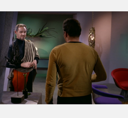
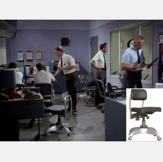
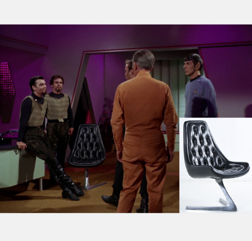
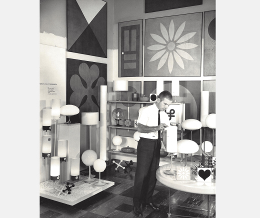
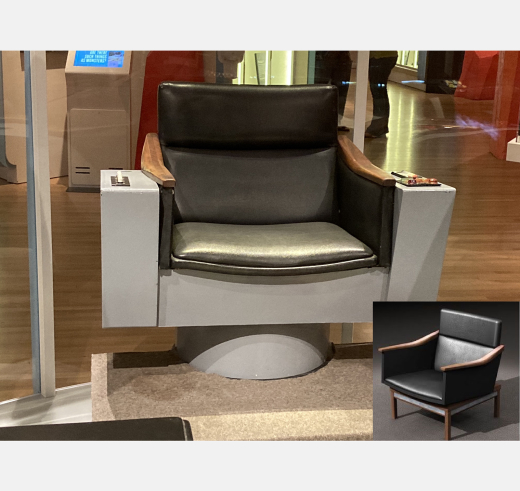
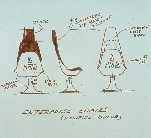
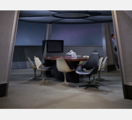
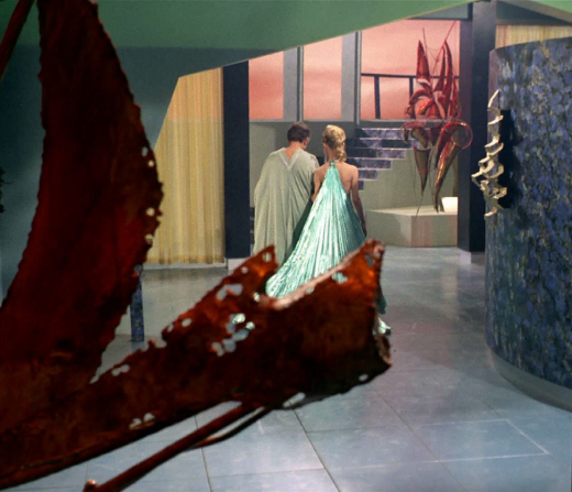
This article summarizes the recent book Star Trek: Designing the Final Frontier, authored by Dan Chavkin and Brian McGuire and published by Weldon Owen International. The book is a thorough examination of the art direction and set decoration of The Original Series, outlining how Midcentury Modern design was employed to depict the world of the future. The book presents 33 designers representing 10 countries and 32 manufacturers, and highlights 13 key episodes of The Original Series. Illustrations include episode images and stills, high-resolution images of design objects used in the set decoration, futurist architecture, vintage advertisements, and numerous sketches and storyboards of Art Director Walter "Matt" Jefferies, most never seen by the public. Also included is a catalog of featured items to assist you in propelling your living space into the 23rd century.
Star Trek: Designing the Final Frontier can be ordered through the publisher Simon & Schuster or through the Docomomo US Bookshop.org storefront (a percentage of these sales will be donated back to Docomomo US).
Few can deny the profound impact that Gene Roddenberry's original television series Star Trek had on our perceptions of the present and our hopes for the future. Debuting in 1966 and lasting three seasons, Star Trek is still being rewatched, dissected, discussed, and rebooted. Why has it persisted so long?
The contained environment of a spaceship—the USS Enterprise—was a compelling metaphor for an idealized Planet Earth: a diverse civilization living and working together in harmony. The story lines were often allegorical of contemporary issues, some of which still persist today. The various themes that Gene Roddenberry tackled in Star Trek have proven to be timeless, perhaps because they speak of the human condition. Star Trek also resonated with viewers through its slick and promising imagery of the future.
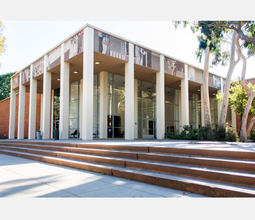
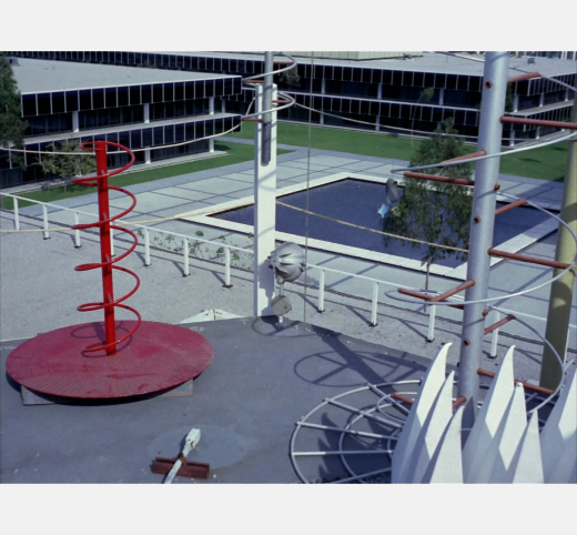
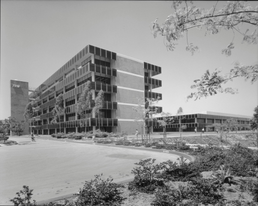
Just as interesting is how the producers of Star Trek, on a tight weekly budget at Desilu Studios in Culver City, California, went about depicting the twenty-third century in a way that was practical, affordable, and believable. Paradoxically, they tapped into the present and the near past, sourcing from the design genre of Midcentury Modernism, known for its clean simple lines and futuristic feel. Happily, 1960s Los Angeles was a hotbed of innovation and a fertile source of forward-looking architecture and design.
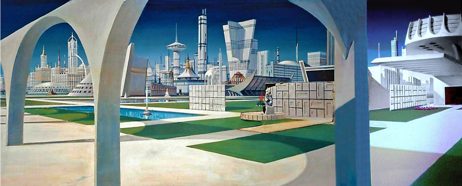
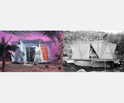
The format of Star Trek was "to seek out new life, new civilizations, to boldly go where no man has gone before." Which meant in theory creating a new planet every week. This potentially cost-prohibitive dilemma was accomplished by either the use of matte paintings as a backdrop for live action, on-location shooting where feasible, or building key structures de novo on a sound stage. Matte artist Albert Whitlock's representation of the planet Eminiar VII (Figure 1) shows how set design was heavily influenced by prevailing midcentury architecture: the stylized buildings in this image evoke actual structures one may still see today.
