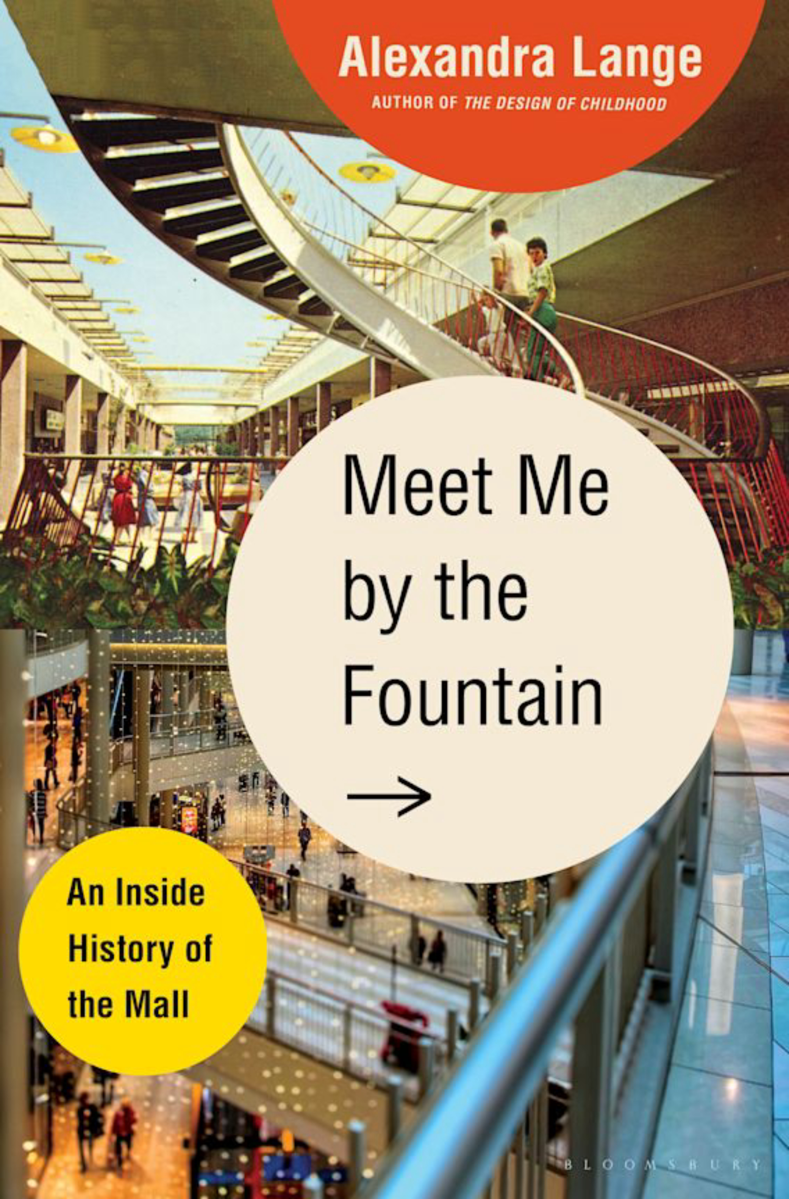
Meet Me by the Fountain

Author

Alexandra Lange

Tags

special edition, Shopping Malls, Book Excerpt
Image details

Many thanks to Alexandra Lange and Bloomsbury USA for their generous contributions to our efforts. The following is an excerpt from Lange's recent book, Meet Me by the Fountain: An Inside History of the Mall, published June 2022.

Every Day Will Be a Perfect Shopping Day

In 1942, leading design magazine Architectural Forum asked a variety of American architects to contribute to a new master plan for Syracuse, New York, to be published in the May 1943 issue under the rubric “New Buildings for 194X.” Syracuse was seen as representative of midsize American cities, with its population of seventy thousand and a central eleven-block pedestrian area bookended by city hall and a theater. By the early 1940s, downtown Syracuse merchants already feared they were losing shoppers to edge retail strips with better parking. [Victor] Gruen and [Elsie] Krummeck, known for their Grayson’s work, were asked by Forum editors to design a prototypical neighborhood shopping center. “I first considered the idea of a ‘mall,’” Gruen recalled, “because of my daily confrontations with a problem particular to Los Angeles: though there were endless shops on both sides of the main thoroughfare, shoppers could reach them only by car.”

The partners immediately started tinkering with the Forum editors’ brief, wanting to create a space to do more than just shop. Their first sketches faced the stores inward toward a landscaped plaza, with the backs to surrounding highways, and included a “garden restaurant, milk-bars, music stand, and other recreational facilities.” Architects had already begun to advocate for shopping centers as both retail and social hubs, suggesting playgrounds, schools, and theaters as add-ons to agglomerations of shops. Developers also saw such civic additions as a way to increase their profits by creating an atmosphere to encourage lingering.

Within months, Gruen and Krummeck were proposing a neighborhood shopping center serving twenty thousand to twenty-five thousand people, with a circular building as its hub. A green walkway followed the outer edge of the building, with parking lots beyond. The central building looks like an Apple store avant la lettre: Floor-to-ceiling glass faces the walk and partitions the whole pie into wedge-shaped stores. The shopper could move from store to store via the sliding-glass doors. Gruen and Krummeck had conceived a connected interior retail space that had much more in common with the glass- roofed gallerias of Europe (albeit contained in a radically new form) than with the car-focused shopping plazas of America.

Architectural Forum editor George Nelson, an architect and a designer in his own right, hated their idea, writing that a circular building would eliminate the complex’s most attractive feature, the courtyard, and questioning the shopping center’s placement at a highway intersection. In response, Gruen and Krummeck stuffed their glass pavilion into a duller shell: a U-shaped plan with two long retail buildings facing an open- air courtyard, a covered walkway wrapping the front of the stores as all-weather protection. “For the shoppers there is a covered walk connecting the stores, a restful atmosphere and protection from automobile traffic,” they wrote in Forum. “All necessities of day-to-day living can be found in the shopping center: post office, circulating library, doctors’ and dentists’ offices, and rooms for club activities in addition to the usual shopping facilities. Shopping thus becomes a pleasure, recreation instead of a chore.”

Gruen and Krummeck’s interest in modern materials remained in the sliding-glass doors they proposed for the courtyard-facing storefronts. In back, facing the parking, opaque facades covered in a hardwood veneer were punctuated with pop-out display windows made of the same plastic used for B-17 bomber turrets. This two-facade setup was reminiscent of the way they handled their Los Angeles commissions: bravado for the boulevard side and something smaller for the parking lot in back. They also emphasized lighting, wrapped the concrete structural columns in plastic sheathing, and specified luminescent paint for the walkway ceiling, so the whole thing would look shiny and new without the space-age styling of the circular version. As with the Milliron’s ramps, the initial language of new shopping spaces was closely tied to speed, innovation, and transportation; coming out of wartime deprivation, shopping was seen as patriotic and future- oriented, if only developers and storeowners would give innovators like Gruen and Krummeck the means to experiment.

This, then, was the background for Gruen’s unplanned stopover in Detroit. He knew American downtowns. He knew department stores. He knew autopia. When he visited Hudson’s the day after his car tour, he could see it was an exemplary store: thirteen floors of well-chosen, well-arranged goods. The Hudson family had a close relationship with the Detroit Institute of Arts, where the store had recently underwritten an exhibition of advanced international modern design for the home. But all that good taste and all that history would be no match for the convenience of car-centric shopping outside Detroit’s city limits.

When he finally reached New York, Gruen wrote a ten-page letter to James B. Webber, nephew of J. L. Hudson Company president Oscar Webber. In the months following the successful opening of Milliron’s, Gruen had published a series of articles framing that store’s success for different audiences. The design press praised the futuristic design and cited the civic amenities Gruen and Krummeck had embedded in a suburban structure. But Gruen wanted clients—clients rich enough to fund his experiments and forward- thinking enough to buy land at the edge of cities. He wrote for department store executives, for bankers, and for commercial developers, broadening his ideas and hoping to expand their reach outside New York and Los Angeles. He used economic language to appeal to J. L. Hudson executives, flattering their store as “superior” while dangling the threat of obsolescence. James Webber wrote back to Gruen, telling him to “drop by” if he found himself in Detroit again. Gruen made that trip happen, this time without the excuse of fog.

James Webber explained that his uncle felt Hudson’s size was part of its competitive advantage: Extracted from its historic place at the center of the city, would the brand hold its mystique? Like Gruen, Oscar Webber turned up his nose at the existing shopping plazas, finding them unattractive, hard to reach, and down-market. The resplendent downtown edifice symbolized Hudson’s civic importance: What form would allow it to hold that position when its customers, and its workers, seemed to prefer single-story and spread out rather than tall and dense?

The solution, in Gruen’s mind, was to remake the circumstances of the downtown Hudson’s somewhere other than downtown. Hudson’s should, once again, be a pioneer: It should reshape the sprawl into a setting worthy of the brand and build a shopping center, with a new department store as anchor, “of exceptional size and quality…a cultural, social and service center for the more than five hundred thousand people who lived in its vicinity.” Similar thinking had impelled General Motors, Futurama’s sponsor, to transplant its executives and engineers from a tower in downtown Detroit to a spread- out campus in suburban Michigan in 1956.

Gruen always saw the next big thing—the boutique to the department store, the department store to the shopping center—and he had the publicity instincts to follow it up, articulating his ideas in blunt language for executives while he and his firm drew fresh, enticing pictures of their ideas. His shopping environments led consumers to stay longer and buy more, his architectural pitches convinced owners that building bigger would sell more. When he returned to Detroit for the third time, he presented to Oscar Webber and other store directors. At the end of the hour-long presentation, Oscar Webber asked. “How do you, Victor, imagine that we could solve all these problems by erecting a single, large-scale center? In my opinion, at least four centers are needed.” Gruen, no fool, responded, “Oscar, I think you are absolutely right.”

Within the week, Gruen and junior partner Karl Van Leuven were ensconced in a Hudson’s boardroom, scouting suburban sites and putting together a plan. Within the month, they presented J. L. Hudson leadership with a “master decentralization plan,” showing four regional shopping centers located in a broad arc at the edge of Detroit’s current suburban development, approximately ten miles from the flagship store: Northland, Eastland, Westland, and Southland, setting up a mall naming tradition as well as a development pattern that would carry through the next three decades. Their site choices bet on the continuing dispersal of Detroit’s population outside the established set of suburbs and encouraged speculation on what was then inexpensive Michigan farmland. They also suggested that the company buy a significant amount of land around the planned shopping centers, blocking rivals and ensuring a level of control over the surroundings that wasn’t possible in the city. These centers would cure the “ugly rash on the body of our cities,” Gruen said at the eventual opening of Northland. The control exerted by the architect and owner would allow for a more pleasingly ordered landscape, with fewer signs and buildings competing for motorists’ attention. The Grayson’s and Milliron’s stores had been among the first to demonstrate the allure of the building as billboard, but that didn’t mean that every gas station and burger pavilion should have its name in lights; while Gruen embraced commercialism in a way that made many of his modernist peers uncomfortable, he still believed in design standards. (More than two decades would pass before postmodern architects elevated the neon-lit, uncurated roadside into the aesthetic pantheon.) The executives were convinced, and by early 1950 they had purchased hundreds of acres in Harper Woods and Southfield, Michigan, for development as Eastland and Northland, respectively. Materials shortages as a result of the Korean War put plans for Eastland on hold, while Northland went ahead in 1952.
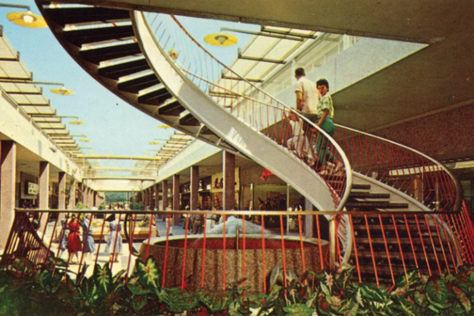
Northland opened in March 1954 and was covered by the national press as a state-of-the-art development in urban planning, architecture, and even public art. Architectural Forum called Northland “a new yardstick.” Five-year-old Jerry Webber, the great-great-nephew of J. L. Hudson, cut the ribbon. An average of forty thousand to fifty thousand visitors showed up per day, far more than needed to make a regional shopping center profitable. The design itself was an attraction. The layout was simple: A large, square Hudson’s department store sat at the center, dressed in simple brick with a vertical grid of white concrete columns offering some articulation and distinction from a distance. At the ground level, the edge of the building sat back from the grid, creating a fourteen-foot-deep covered passage around the edge of the whole complex. Five additional buildings with smaller stores flanked the sides and back of the anchor store in a “cluster scheme.” Between each of the buildings, landscaped plazas with fountains, flowers, sculpture, and trees offered seating and shade. Each plaza had a different name and character, providing circulation and a sense of orientation for the shopper. Gruen referred to these spaces between the buildings as the shopping center’s most important “town-planning element,” and named them accordingly after the courts, terraces, malls, and lanes that make up European cities.

“This is a classic in shopping center planning, in the sense that Rockefeller Center is a classic in urban skyscraper group planning…[Northland] is the first modern pedestrian commercial center to use an urban ‘market town’ plan, a compact form physically and psychologically suited to pedestrian shopping,” cooed Architectural Forum’s critic, now far better known for her defense of downtowns and urban living — in 1954 even Jane Jacobs could be a fan of the mall.

Journalists also cooed over the art. “For a really screwball fountain, the place to go is Northland Shopping Center, north of Detroit. Here is a collection of jets and sculpture that would delight Rube Goldberg, and does delight constant streams of visitors,” wrote Grady Clay in Fortune. “People flock and stand, fascinated by the interplay of small wheels, levers, jets, spurts, and streams, a fantasy of motion and invention. Here, it seems to me, lies the promise of the future; the application of humor, inventiveness, and ingenuity to enliven display and entertainment.”

Landscape architect Edward Eichstadt supervised the courtyards’ arrangement and plantings. Lily Swann Saarinen (wife of famed architect Eero, whose office was in nearby Bloomfield Hills) coordinated the outdoor sculptures, contributing a work of her own, a wall- size ceramic map of the Great Lakes. A twenty-two-foot-tall totem pole in wood and steel, created by artist Gwen Lux, became the center’s meeting spot. Vertical artworks of all kinds, from whimsical clocks to gilded stabiles to abstract steel figures, became a constant presence in malls thereafter. As Gruen wrote, “The average visitor to a shopping center cares less about the facade than about the character and atmosphere of the public spaces, where one might stroll or sit on benches.” These totems functioned as meeting places, but on another level, they gave the shopping center identity and personality. Indoor malls’ exterior facades became only more boring over time, and while stores might come and go, a single dramatic accessory could represent the place’s unique character. Better to spend money on that, mall architects soon learned, than on expensive cladding and fixtures.

 meet me by the fountain book cover


About the Author

Alexandra Lange is a design critic. Her essays, reviews and profiles have appeared in numerous design publications including ArchitectHarvard Design Magazine, and Metropolis, as well as in The AtlanticNew York MagazineThe New Yorker, and the New York Times. She is a columnist for Bloomberg CityLab, and has been a featured writer at Design Observer, an opinion columnist at Dezeen, and the architecture critic for Curbed. Her latest book, Meet Me by the Fountain: An Inside History of the Mall, was published by Bloomsbury USA in June 2022.