A new developer's impulses clash with Buffalo's 1970s concrete skyscraper

Author

Mark Byrnes

Affiliation

SOM

Tags

Newsletter, special edition, 70s Turn 50
Image details

An energetic D.C. real estate mogul has swooped into Buffalo to bring the city’s tallest building, SOM’s Marine Midland Center, back to life. The result is an unfocused mish-mash of interventions on what once exemplified the sophistication of its original architects and their client.

Baseball fans who’ve watched a relocated Toronto Blue Jays “home game” in Buffalo on TV during this topsy turvy, pandemic-shortened MLB season may have caught a few glimpses of the city’s very un-Toronto-like skyline. Decades of economic stagnation have allowed the view from center field—anchored by a handsome collection of late-19th to mid-20th century architecture—to remain nearly unchanged since the retro revival ballpark now known as Sahlen Field (HOK Sport, 1988) debuted.


Popping out from the roofline from foul pole to foul pole, there’s the Old Post Office (1901), a Gothic Revival structure behind the third base line; One M&T Center (1967), a white marble and glass tower by Minoru Yamasaki next to the steel and glass Main Place Tower (1969) by Harrison & Abramovitz; they’re behind what was once the world’s largest office building, Ellicott Square Building (1896), a hulking Italian Renaissance Revival structure by Burnham & Company. Running down the first base line to right field, two towers left behind by the defunct Marine Midland Bank mark the southern end of the central business district. There’s the Marine Trust Building (1913), a brick and granite tower by the locally revered Green & Wicks, and finally, SOM’s Marine Midland Center (1974). If you have seen a Blue Jays home game recently, maybe you’ve wondered about that one—the bulky concrete and glass tower that casts a shadow over the outfield, dominates the skyline, and is halfway through a brazen makeover.

Marine Midland Center, now known as Seneca One, is undergoing an extensive $120 million transformation inside and out as Washington, D.C.-based Douglas Development prepares it for a new life as a mixed-use hub with apartments, retail, and a lot of tech-centric office space. The changes go well beyond the addition of “terra cotta” and “gun-metal gray” paint to the concrete facade. Outside, new wind barriers and infill buildings of varying materials and styles fortify its public plaza, absorb much of the open space, and diminish its original public sculpture. Inside, new interior furnishings in the lobby establish a scatterbrained departure from the corporate modernism SOM mastered in the years following World War II and the impeccable art collecting instincts of their Buffalo client.

After sitting almost completely vacant since 2013 in a market with limited demand for commercial space, the tower’s revival is a real estate godsend and a source of civic pride. Douglas Jemal, founder of Douglas Development, has received nothing but praise from local media and the Instagram feeds of countless Buffalovers for his efforts. Despite its commanding presence on Buffalo’s skyline for nearly 50 years, curiosity about the complex’s history and design remains limited. Besides a general aversion to postwar concrete buildings across the U.S., Marine Midland Center’s confusing and somewhat unfriendly relationship with its immediate surroundings over the years likely explains the lack of affection. Should one want to know more, however, they’ll discover a building that tells the story of a regional bank reaching its peak under a chairman who also helped the city’s major art gallery develop one of the U.S.’s most impressive 20th century collections and formed a strong relationship with an architecture firm that established the visual language of corporate America after World War II.

A bank and its chairman

Completed in 1974, Marine Midland Center was described by New York Times architecture critic Ada Louis Huxtable shortly after its opening as “a consummate example of 20th century corporate art, inside and out.” Today, it still stands as the city’s tallest building by far at 530 feet (150 feet taller than next-tallest, City Hall). It was the architectural culmination of the bank’s steady rise and firm commitment to the city it started in.

Marine Bank was chartered in 1850, and as its name suggests, it depended on the bustling commercial activity along Buffalo’s waterways. Its first office at 79 Main Street was just steps from the western terminus of the Erie Canal, and its various headquarters were never too far from its origins. Known as Marine Midland Trust by 1913, it moved into a 17-floor tower by Green & Wicks on the corner of Main and Seneca. After a series of mergers, Marine Midland was structured as a collection of 10 banks (New York State had nine banking districts) with slightly different names. Together, they formed the 12th-largest bank in the country by the time it moved into its SOM-designed headquarters in the early ‘70s.

Overseeing much of the bank’s 20th century ascent was Seymour Knox II, a Buffalo native and son of a businessman who had served as Vice President of the Woolworth Co. and Chairman of the Board of Marine Trust. After the elder Knox died in 1915 at the age of 54 Knox II took on leadership positions at Woolworth and Marine soon after his graduation from Yale in 1921. Knox eventually became chairman of Marine Midland Trust Company of Western New York in 1943 but he was most known outside of Buffalo as “the dean of American art patrons.”

In 1938, Knox was elected as president of the Buffalo Fine Arts Academy Board, the parent organization of the Albright Art Gallery. He and his family helped financially support the establishment of the museum's Room of Contemporary Art with the intention to implement an artist-centric philosophy of collecting. In 1955, Knox began a fruitful collaboration with the Albright’s director Gordon Smith, nurturing relationships with emerging artists and leading an impressive expansion of the museum’s collection. Much of the collecting happened through visits to New York’s galleries, including that of Buffalo native Martha Jackson, whose dealership in Manhattan (open from 1953 until her death in 1969) served a crucial role in the success of emerging artists and art movements at the time. According to a profile of Jackson on her hometown art gallery’s website, she “tirelessly negotiated on the museum’s behalf by making sure that its primary patrons, as well as its directors, were given first dibs on the best works, and by offering them significant discounts whenever possible.” It is purported that she is also the person behind Knox’s introduction to another Buffalo native thriving in New York, Gordon Bunshaft of SOM. The singular design star inside the large and mostly anonymous firm was chosen in 1958 to take on the museum’s expansion after it moved on from Paul Schweikher’s poorly received proposal. Bunshaft’s design, which reflects the best of SOM’s mid-century glass-and-steel modernism while also respecting the original neoclassical structure it connects to, was widely celebrated upon its opening in 1962. Bunshaft later recalled being treated by Knox and the museum as if he were Michelangelo. “I worked even harder on that building than I have ever worked before in my life,” he told the Buffalo Evening News years later.

The Marine Midland-SOM connection

The 1950s and ‘60s were an especially prosperous time for SOM, its budding reputation established by era-defining office buildings in Manhattan including Lever House (1952), Manufacturers Trust (1954), Union Carbide (1960), and Chase Manhattan Plaza (1961). But the firm was not limited to New York. Out of its Chicago office came the Inland Steel Building in Chicago’s Loop (1957) and the Hancock Center (1969) along the Magnificent Mile. Marine Midland was no stranger to the work of SOM’s two main offices, having moved its own Manhattan offices into (and acquired the naming rights for) a Bunshaft-designed tower in 1967 now known as 140 Broadway. In 1970, the bank’s Rochester offices moved into a new downtown tower designed by SOM Chicago’s engineer-architect duo of Fazlur Kahn and Bruce Graham who were most known for the Hancock Center and Sears Tower (1973). The bank also occupied space inside the Bunshaft-designed Carborundum building (1972) in downtown Niagara Falls, New York.

In Buffalo, Marine Midland had previously worked with Bunshaft on a relatively modest project, updating the banking hall in its Green & Wicks tower (praised in a 1974 Buffalo Evening News feature on the architect as “one of the loveliest interior spaces in the area”). Knox, a State University of New York at Buffalo trustee, would have also been well aware of Bunshaft’s rejected design in 1967 for the university’s massive suburban expansion. SOM fulfilled its contract to create a campus masterplan after Bunshaft angrily quit the project, but another firm was eventually hired to take over. Instead of asking the familiar faces at SOM New York to work on the bank’s downtown tower, Knox and Marine Midland went with the firm’s San Francisco office.

Marine Midland originally targeted properties just north of its Main Street building for a new headquarters until deciding on a site directly south, to be developed by the Boston-based Cabot, Cabot & Forbes. The bank effectively functioned as SOM’s client and occupied about 80 percent of the building upon its completion. John Merrill was the partner in charge of the project and his team included architect Marc Goldstein, interior designer Margo Grant, interior design consultant Davis Allen, and graphic designer Jim Hill. Each played a critical role in the firm’s 20th century history, especially Merrill, one of the founding partners. Goldstein served SOM’s San Francisco office for 30 years; Grant spent over a decade at SOM as it built out its interior design practice; and Allen was a 40-year-employee at SOM who served as senior interior designer on 50 projects for their San Francisco, Chicago, and New York offices.

Most likely because of SOM’s image as a monolithic institution with few starchitects or inter-office distinctions at the time, Marine Midland Center is inaccurately credited to Bunshaft by multiple online sources and even a prominent book about the city’s history in which the author snarkily describes the design as the architect’s “revenge on his hometown” for not getting his SUNY Buffalo megastructure built. Alas, whatever reasons behind the bank’s decision to not work with Bunshaft on this remain unknown. “I’m not really sure how it came to the San Francisco office. But somehow it came to me,” Goldstein recalled in a 2008 interview with the Art Institute of Chicago. He died in 2015. Nicholas Adams, author of both a Bunshaft biography and a history of SOM, is also unsure. “I asked Mark Goldstein this before he died and he didn’t have a good answer. ‘Well, they liked our work.’ I just don’t know. No one knows,” the historian told me in 2019. “It was interesting that Mark didn’t answer the question, I pressed him a couple of times,” he added. “Seymour may have liked SOM and decided he didn’t want to work with Bunshaft or vice versa because the project didn’t interest him.” In 1972, the same year workers started to move into their new desks inside Marine Midland Center, Bunshaft told the New York Times, “I don’t consider office buildings major architecture anymore.” In 1974, however, two prominent Midtown towers designed by Bunshaft, the Solow and W.R. Grace buildings were completed. His last major project, the National Commercial Bank tower in Jeddah, opened in 1983. The architect and his wife donated works to the Albright-Knox throughout the ‘70s and when Bunshaft won the Pritzker Architecture Prize in 1988, Knox II sent Bunshaft a warm letter congratulating him (as did his son, Seymour Knox III). The two men died one month apart in 1990.

Goldstein, meanwhile, loved the commission and the client. He said in his Art Institute of Chicago interview that he considered Knox to be one of his favorite clients ever. “[He] used to take me down to New York on his art-buying sprees, and I would walk into a gallery with him, and it would be like walking in with King Midas—people treated him like royalty. He was such a sweet, wonderful man,” recalled the architect. Later on in the same interview he considered the project “... a very, very thorough job. Not only the shell of the building, but the interiors as well. So that was really a pleasure. And they [Marine Midland] were just wonderful people to work with.” Goldstein recalled in the same interview designing one other Buffalo project, an owner’s suite inside the WPA-era Memorial Auditorium for the NHL’s Buffalo Sabres. The franchise was founded in 1970 by Knox’s sons, Seymour III and Northrup. Like Bunshaft’s banking hall renovation, records of this project have yet to be discovered in SOM’s archives.

Marine Midland Center was included in SOM’s 1963-1973 monograph along with the more famous Marine Midland building in Manhattan, the Hancock Center in Chicago, and one of the San Francisco office’s most celebrated 20th century projects, the Bank of America Center (now known as 555 California Street). In the monograph introduction, former MoMA director Arthur Drexler succinctly summarizes the state of the firm’s reputation at the time, “Once praised for the consistent quality and character of its work, then sometimes criticized for being too consistent, SOM’s recent practice often draws simultaneous praise and blame—to the same building—for the consistent quality of its innovations.” This summary fits the Marine Midland Center quite well. Developers, tenants, and engineers are most likely to praise it for construction quality, floor plate size, user circulation, and energy efficiencies. Fans of modernism appreciate its interior design, art programming, and a forceful-yet-restrained presence on the skyline. Detractors will point out various urban design shortcomings, interpret the interiors as impersonally corporate, and argue that its presence is unacceptably cold and arrogant in a 19th century city traumatized by thoughtless 20th century interventions.

Corporate modernism, for better or worse

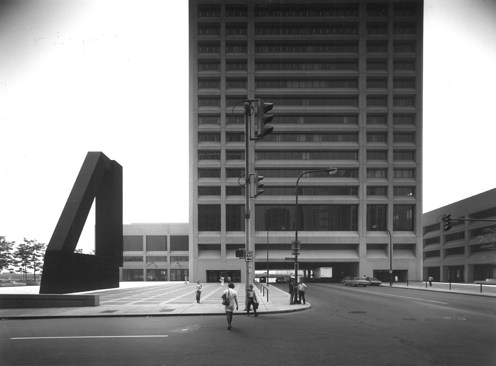
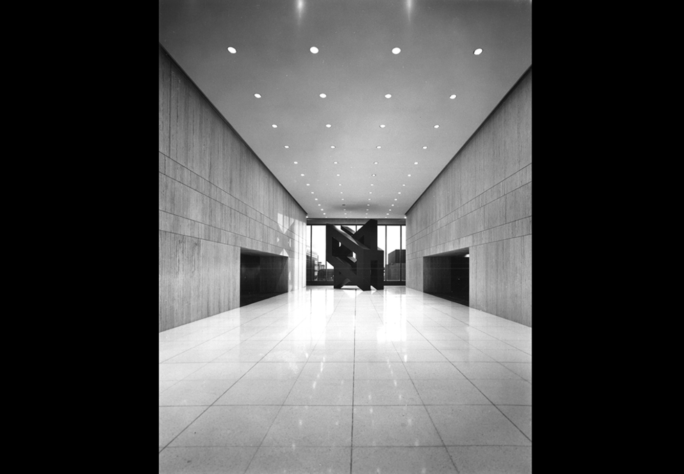
Marine Midland Center occupies two blocks, with Main Street splitting straight down its east and west plazas. A 38-story tower hovers over Main while an L-shaped ancillary building supports the south end of the site and wraps north on the west side. The annex connects to the tower through a bridge that leads to the tower’s third floor lobby which contains an auditorium and cafeteria, sculptures, and impressive city views courtesy floor-to-ceiling windows about twice the height of any other tower floor. The annex building originally contained space for a restaurant and shops on the west section and a branch bank in the south wing. Upon completion, the entire project contained 1.4 million square feet of space including underground parking and a basement area for the bank’s computer center and mechanicals. The facades are clad in 4-inch-thick chamfered precast concrete panels, and finished with washed silicate gravel. The window ribbons have bronze tinted glass panes with dark anodized aluminum frames. An unrealized phase two would have spread east—where Sahlen Field and a parking garage connected to the tower stand today—containing another L-shaped building supporting two smaller towers for hotel, office, and retail space extending the project footprint an additional two blocks east.

Few Buffalonians include it on their personal list of favorite tall buildings, their strongest case against it being its urban design. There was simply too much open space at Marine Midland Center, located at an already quiet and windy southern edge of the CBD. To city leaders at the time, this type of modern urban plaza was in fact a major upgrade over the decaying building stock which mostly traced back to the early 1900s and considered “Buffalo’s skid row” by the time of Marine Midland Center’s construction—years since the former terminus of the Erie Canal had any commercial value. Stretches of the canal were filled in and most of the buildings surrounding them were demolished by the 1960s. SOM presented its first designs to the city in 1968. Private, federal, and state funds to finance its development soon followed. At its groundbreaking ceremony in 1969, Erie County Executive B. John Tustuska called the project a "major transplant" for a "rundown, disheveled, unkempt, and neglected area." Struggling urban cores all over the U.S., especially the industrial northeast, embraced modernism’s towers and plazas around this time as ambitious solutions to urban blight, satisfying the business community and signifying progress to the public.

Marine Midland’s plaza led to intimidating and confusing entrances into the complex, seemingly designed to invite only those who have business to conduct while dissuading spontaneous and casual exploration. If one bravely decided to enter the tower without an invitation, however, they could only hope that the escalators on the both sides of the tower would lead them somewhere welcoming. For those curious and courageous enough, there was indeed a payoff. The third floor of the tower was the social hub of Marine Midland Center, where visitors and workers converged. While more transparent, the annex’s south wing entry is a significant distance from the sidewalk thanks to the severely sloped site. SOM’s solution for this slope was a perfectly flat plaza that created a blank concrete wall along Washington Street which got taller as one walked down to the waterfront, and interrupted only by an entrance to the complex’s underground parking garage. This treatment was repeated on the west side of the complex, where the annex reaches closer to Seneca Street—the cross street along the north side of the complex. Modernist landscaping resulted in large concrete boxes with flowers and honey locust trees that also functioned as places for workers to eat a bag lunch or take a smoke break, but not much else.

The street level of Marine Midland Center’s south end was designed for services and deliveries, effectively surrendering to the site’s hostility established by highway overpasses which run parallel to it and separate downtown from the waterfront. Staircases on both sides of the south end lead to the rear of the annex and a narrower section of the plaza. SOM’s work here spares the CBD of the blight of the highway by spreading itself across Main Street but it created its own intimidating presence. Along the street and under the tower, blank walls, brutal winds, and confusing secondary entry points made for an isolating pedestrian experience. A decade into the building’s life, cars were  banned along Main Street for a modest light rail system, furthering the sense of isolation along this end of downtown. The transit project did lead to what were essentially extra-long station shelters (interrupted at Seneca Street) to help pedestrians manage the intense winds between train stop and tower entrance.

A persistent security presence along the outdoor sections of the complex during the bank’s later years assured limited loitering, as if the typically empty plaza’s purpose was to be a concrete moat between the bank and the public instead of a gift to a downtown desperate for attractions. On an overcast weekend afternoon towards the end of the bank’s occupancy, this writer was asked by security to stop photographing the plaza’s enormous Ronald Bladen sculpture. I would have to move to the city-owned sidewalk if I insisted on getting a picture without any trouble.

A sculpture for the skyline

At 60 feet tall, “Vroom, Shhhh” (sometimes spelled “Vroom SH-SH-SH”) , was Bladen’s largest ever and one of the largest modern sculptures in U.S., topping by 10 feet the Picasso sculpture in Chicago’s Civic Center Plaza (1967) commissioned by SOM Chicago’s William Hartmann. Knox personally commissioned the work and would have been quite familiar with the artist’s reputation as a respected minimalist sculptor who had painted in an abstract expressionist style. Unsurprisingly, there’s a chance Knox discovered Bladen through Martha Jackson. His piece, “White and Black Collage” was included in her gallery’s June 1960 exhibit, New Media: New Forms in painting and sculpture while another one of his collages, “Black/Blue/Yellow” (1960), was gifted to the Albright-Knox from Jackson’s collection after her death. If it wasn’t Jackson, it may have indirectly been Nelson Rockefeller, who made Knox the first chairman of the New York State Council on the Arts and placed him on the Empire State Plaza art collection commission. The massive government center in Albany was Rockefeller’s pet project among an impressive list of infrastructure initiatives he shepherded across the state during his reign as governor from 1953 to 1972. Bladen was selected in 1970 to create a sculpture for the Albany project (this was one of the few pieces selected by artists instead of the committee, but Knox would have certainly been aware of the decision). Titled “Cathedral Evening,” Bladen’s steel addition functions as a counteraction to the emptiness of the plaza with its directional lines providing focal guidance to its viewers. In some ways, it resembles a sharply bent version of what he’d come up with in Buffalo.

For Marine Midland Center, Bladen created a steel structure with an open core and painted semigloss black. It is composed of a base, a cantilevered vertical pier, and an angular beam. In his 2019 book on the artist, Robert Mattison explains that the “the sculpture’s surfaces are either thrown into deep shadow or glimmer with reflected light that picks up the blue tint of the sky,” as a result of the semigloss paint. “Simultaneously,” he adds, “these reflections highlight the volume of the work and lend it a mysterious presence.”

The artist traveled to Buffalo in order to make something truly site-specific. He was generally interested in the structural elements and massing of brutalism and was taken by what Goldstein and his San Francisco team was delivering in Buffalo. Goldstein later said that “Vroom, Shhh” works well with the oblique surfaces in the architecture. Mattison’s research mentions a surprising source of inspiration. On a walk to his Manhattan studio during the planning process for “Vroom, Shhh”, Bladen noticed how the Flatiron Building, when seen from the north, simultaneously highlights the verticality of that structure and its unfolding mass. He modified the design for Marine Midland making the sculpture 5 feet wide at its front edge and 10 feet wide at the rear. Bladen once explained that “the visibility and the space” around the Marine Midland Center interested him and that he was “very involved with the highway system that leads to Buffalo.” Mattison hypothesizes that the sculpture’s name derives from the roaring traffic he would have heard from that highway as he walked along the project site. While “Cathedral Evening” points visitors to the plaza it sits in, “Vroom, Shhh” leads viewers to the soaring tower it supports. Bladen’s work does not necessarily evoke charm but it does accomplish what its creator wanted out of all of his public sculptures, “to create a drama out of a minimal experience… to make use of it in terms of geometrical experience.”

Beyond Bladen

More sculptures could be found in the lobby. Antoni Milkowski’s “Millinocket” consists of three metal parallelograms painted black. Nearly reaching the ceiling, this piece resembles a denser, condensed twist on Bladen’s plaza piece with openings inside each parallelogram to see through the lobby and outside the nearby windows. With the middle parallelogram running in the opposite direction of the two sandwiching it, “Millinocket” provides a dynamic modernist presence in a generously open space. The artist gifted an aluminum study for the piece to the Albright-Knox in 1973. And like Bladen, one of his sculptures can be found at Rockefeller’s Empire State Plaza. It has since been moved to a less prominent area of the lobby.

SOM also contributed to the collection, with Hill’s 10 geometric wall sculptures in the Garden Terrace restaurant providing energetic 3-D bursts of color along travertine walls. Hill also created a similarly styled stage screen for the auditorium. The surrounding 3-D gridded screen walls resemble an op-art work, in line with the art theme throughout the complex. Hill’s cafeteria pieces were removed during a mid-2000s renovation of the space while the auditorium stage screen was removed at an unknown date.

From 1973 to 1996, Chryssa’s “Gates to Times Square” was the lobby’s show-stealer, loaned to Marine Midland by the Albright-Knox. The 10x10x10-foot piece is made of cast stainless steel, plexiglass, and neon tubing. Considered her finest and most essential work, the piece powerfully exemplifies the Greek artist’s fascination with Manhattan's commercial signage. Allured by the Latin and Chinese characters she saw all over her adopted city, Chryssa created neon and metallic symbols that resembled abstracted forms of such signage in making her own distinct forms. Chryssa is widely credited as one of the very first artists to meaningfully work with neon. “Gates” resembles a giant, fractured letter ‘A’ from an illuminated advertisement, propped up and split in half for one to walk through and absorb the scale and materials that express her interpretation of American urbanity. At the top of both sections of the plexiglass-enclosed ‘A’ sits rolled up papers with plans of the full piece. Completed in 1966, it was given to the Albright-Knox in 1972 and graced the cover of the museum’s Chryssa: Urban Icons 1980 exhibit book. The museum’s relationship with the artist dates back to Knox’s purchase of her “Letter ‘T’” (1959) cast aluminum sculpture in 1961 and she would later establish a strong working relationship with SOM’s Chicago office, creating a series of giant, illuminated ‘W’’s suspended in the atrium of their 33 West Monroe building in the early ‘80s. Before arriving in Buffalo, “Gates” was initially exhibited inside Manhattan’s Pace Gallery, then Grand Central Station as part of the 1968 City Sculpture Exhibit. Its presence inside the Marine Midland Center’s lobby with its panoramic views of downtown allowed “Gates” to continue its life as a highly visible urban sculpture.

The Marine Midland Center’s art programming was not limited to just sculpture. Knox and his team accumulated over 500 prints and 36 paintings, mostly optical and pop art for the office interiors (the paintings were for the 23 and 24th floors where the executives were located). Dozens of pieces were exhibited inside the Albright-Knox for a two-week show in September of 1971, Graphics From the Collection of the Marine Midland Bank-Western. The catalog includes over 200 works from a who’s who of contemporary artists including Richard Anuszkiewicz, Max Bill, Al Held, Robert Indiana, Ellsworth Kelly, Helen Frankenthaller, and Andy Warhol. Such pieces are present throughout SOM’s promotional photos of the project.

On the top floor of the Marine Midland Center, two wool tapestries (approximately 7.5 by 3 feet) by Jan Yoors hung up in a lounge area that led to an adjacent restaurant. The artist’s abstract tapestries, starting in the 1950s, typically drew inspiration from nature. With Negev 1 and Negev 2, commissioned by the bank and SOM in 1971, Yoors’ refined approach—bold and two dimensional shapes with a self-imposed color limit—are on full display. These two pieces were inspired by photographs the artist took of the Negev desert in Israel during Yoors’s 1967 photographic commission to travel the world documenting postwar religious architecture for the First International Congress on Religion, Architecture and The Visual Arts. Their presence on the 38th floor appeared calming and sophisticated, a backdrop as workers and visitors socialized before entering the adjacent dining room.

A Harry Bertoia screen found a home inside the lobby as well but its origins are unclear. The roughly 1-foot-thick, 6 foot by 6 foot piece resembles a section of the large screen wall he designed for Bunshaft and SOM’s Manufacturers Trust of Hanover building. It does not appear in any of the project’s promotional photos found in SOM’s archives so it’s unlikely that the San Francisco team had any role in its commission. According to its 2015 Sotheby’s listing, it was commissioned in 1970 but the Bertoia Foundation has no record of Knox, Marine Midland, or SOM asking for such a piece. Because of its similarity to the Manny-Hanny screen, the Bertoia Foundation speculates this work looks more like something the artist would have made in the ‘50s or ‘60s and that the bank purchased it on its own at some point. Bertoia had previously designed sculptural screens for the Albright-Knox’s restaurant and permanent collection.

“Solid, scrupulous, impeccable design”

Marine Midland Center’s interiors were great not only because of its art collection. In a November 1976 review for Interiors Magazine, Ruth Miller Fitzgibbons explained that “there are no daring innovations in this project that either turn on or off—no fetishes are displayed beyond the demand for consistent quality. Instead, solid, scrupulous, impeccable design is well-executed by a group of experienced designers who are confident of their design convictions.”

Goldstein, Grant, Hill, and Allen filled the inner life of the complex with contemporary spaces that lived up to SOM’s stellar reputation among America’s corporate giants. Marine Midland center was later included in Maeve Slavin’s 1990 book about Allen. Serving as a retrospective on the designer’s long and pioneering career, the book features photo-heavy project summaries for the 18 SOM projects he accepted credit for their final resolutions. SOM had been one of the first architecture firms to include interior design in its arsenal of specialities. Before Buffalo, Allen had led interior projects for Inland Steel in Chicago and Marine Midland’s Manhattan offices on Broadway. The former was so successful that it was basically understood by clients afterwards that when one hired SOM to design an office tower, they were also hiring them for the interiors. The latter, Slavin, explains in her book, marked a shift from Miesian minimalism towards more colorful office interiors and clubbier executive spaces. Desks were, Allen told Slaving, the cornerstone of the interior design concept at Marine Midland Center. He continued to evolve his boxy, signature ‘tin desk’ concept with a new line of steel and wood desks and storage cubes. These desks, unlike their predecessors, contained front panels that fully concealed the occupants' feet and any wiring, emphasizing a minimalist ambition. Like the desks, the storage cubes were made of steel and appeared in primary colors. For executive-only furnishings, steel was overlaid with burl oak.

These furnishings also functioned as graphic elements playing off of the curated pop and op art visible throughout the office interiors. With Allen’s encouragement, graphic designer Hill presented floor numbers as supergraphics along corresponding elevator lobbies painted in a solid color. The clubbiness Allen pursued at 140 Broadway was carried over into Marine Midland Center’s 38th floor lounge where sofas and lounge chairs he designed flowed together with Yoors’s tapestries and sprawling morrocan rugs. In fact, Allen’s furnishings were found throughout the complex and his team even designed the chinaware used at the 38th floor dining space. Slavin notes in her book that the colorful interiors exhibited at Marine Midland Center were influential in the shift away from grays and dark woods in typical modern workspaces in the following years.

There were at least two floor cuts that led to dramatic connections via an exposed staircase. On a lower level of the tower, an angular stairwell was supported by a white wall while activity up and down the stairwell was seen through a transparent glass wall that went from the base of each carpeted stair to the supportive railing. On a higher level of the tower, a much wider, curved stairwell emerged from a half circle and wound its way down to the lower floor, also with transparent glass covering the base of each carpeted stair to the supportive railing.

Signage throughout the building used the same bold Eurostile font Marine Midland used in their visual identity at the time. Metallic signage spelling out “Marine Midland Center” displayed on the tower facade along the windowless second floor while wayfinding inside along the travertine walls used the same font, asserting a cohesive design for the publicly accessible areas and easily guiding users. Hill’s aforementioned floor number supergraphics were also displayed in Eurostile.

Grant, the lead interior designer of the San Francisco office, had previously collaborated with Allen on the Mauna Kea Beach Hotel Hawaii. She had moved up to associate of interior design by the end of her 13-year stop with SOM but left in 1973—one year before the official competition of Marine Midland Center—for a longer and even more fruitful career with then-upstart Gensler, now an established competitor of SOM.

Marine Midland becomes HSBC

The Marine Midland Center satisfied the namesake bank’s needs for a modern headquarters upon its completion, but a series of important changes soon followed. The Hongkong and Shanghai Banking Corporation (HSBC) purchased 51 percent of the bank in 1980, a serious blow for a declining industrial city with few international headquarters. (Currently, only one Fortune 500 company, M&T Bank, is headquartered in the city.) HSBC’s share of the bank increased to 100 percent in 1987 and Marine eventually surrendered its own name and branding to the parent company in the 1990s after HSBC continued to expand its U.S. assets. Its Buffalo tower was renamed One HSBC Center while the bank’s local workforce was spread out into a newer glass structure nearby, the HSBC Atrium (Cannon Design, 1990) and a suburban office park.

During the early years of HSBC’s control over Marine, the Buffalo headquarters was purchased by Jon Kreedman of Los Angeles. Although HSBC was the major tenant, they “in many ways… owned the building with a 40 year lease below market rent with options to extend that another 20 years,” says Stephen Fitzmaurice, whose involvement with the complex began in 1998 when he was hired as its property manager. He then served as chief operating officer from 2003 until 2014. No serious changes could be made without the approval of the bank which “vehemently resisted any pass through expenses they thought they didn't have to pay,” he says, recalling frequent disputes and arbitrations.

Kreedman hoped to build twin towers on both sides of the plaza facing Seneca Street in order to make the property less dependent on the bank and better connected to its surroundings, but HSBC would not allow it. In fact, Fitzmaurice recalls, “Marine Midland wanted isolation (and security) and they got it to the detriment of future development.” Kreedman let the bank out of a lease for its unprofitable 38th floor restaurant in the early ‘90s and converted it into office space. Ownership of the building changed hands two more times before HSBC’s departure in 2013.

HVAC updates during this period gave the property Energy Star status but the building was in need of serious upgrades by the time HSBC’s last lease in the building was winding down. “We did what was necessary to maintain systems but many were 10-20 years beyond the end of their useful life,” says Fitzmaurice. Elevators, which are typically supposed to be modernized every 20 years or so, were approaching 40. Similarly, he adds, the original chillers were retubed instead of being replaced, because that was all the bank was willing to pay for.

Lease renewal negotiations in 2010 proved to be unfruitful. The bank approached Fitzmaurice’s team with a wishlist of facility upgrades and no rent increase. HSBC simultaneously pursued plans to relocate its tower workers into a brand new building across from the HSBC Atrium. However, new leadership at the bank’s London office informed HSBC USA that they could justify neither a new building nor a new lease at One HSBC Center. The bank ceased its retail operations in the region, selling its branches in 2011 to First Niagara Bank. HSBC maintains a significant office presence in its Atrium and office park to this day.

One HSBC Center became Seneca One upon the bank’s departure. Fitzmaurice’s team had commitments from 200,000 square feet of potential tenants and a proposal to install a co-located data center in the basement where HSBC's data center had been pending a commitment from ownership (a New York City-based group) to significantly reinvest in the complex. Fitzmaurice says that revenue from the data center would cover debt service but ownership walked away from the region and the building’s $75 million balloon mortgage payment anyways. Buffalo’s tallest building then went into receivership and the bank’s art collection was liquidated.

Seneca One’s size and a perceived lack of demand for downtown office space made it difficult for local developers to put together a profitable redevelopment plan. But the bones of the building remained strong. Column-free floors ranging from 18,000 to 30,000 square feet made for efficient, unmatched, and easily adaptable downtown office space. The shell of the building is of great value as well, designed to maximize sunlight and minimize the effects of Buffalo’s brutal winters. Windows were inset to the building so as to not be affected by the sun during the summer while allowing the sun to heat the building up in the winter due to the lower angle. “SOM did their homework,” says Fitzmaurice. “If you understood the basis of the design and Seymour Knox's vision, the building becomes appealing in an aesthetic and community standpoint.”

A second life as Seneca One

It took an eccentric outsider to see Seneca One’s obvious assets. In 2016, Jemal purchased the building for $12 million with every intent on quickly bringing it back to life. When completed, the complex will function as a mixed-use hub, not unlike what the original developers originally hoped for. But Jemal’s plan is certainly not a continuation of SOM's and Knox’s vision, introducing instead a trivial assortment of objects and materials that convey no relation to or interest in the architecture it occupies.

Additions include suspended lighting fixtures, lanterns, and a canoe hanging from one travertine wall. Another canoe is currently standing up next to a “Seneca One”-branded gondola sitting in front of a floor-to-ceiling screen print of a current day urban canal scene in Venice, covering up the panoramic view of the waterfront on the other side of the window. Across from the suspended canoe, the travertine wall in front of the auditorium entrance now hosts two unremarkable and awkwardly placed photo canvases of Buffaloes. Another section of the lobby contains an overproduced panorama of downtown’s skyline. Jemal has also delivered a classic Ford car from his own collection (with Seneca One branding), a bar that was used in The Sopranos, and a relocated Marine Midland bank vault. More decorations may be on the way. Renderings show a main lobby stuffed with varied seating areas, plant walls, and gigantic bird cages strewn throughout for decoration (Jemal owns three parrots, one named Buffalo Bill). According to the building’s official Instagram account, disassembled jail cells from another Jemal property, the former Buffalo Police Department headquarters, will appear in a yet-unannounced capacity. Jemal had previously expressed an interest in making the 38th floor a restaurant again but has instead decided to turn it into event space. A food hall will be where the Garden Terrace restaurant with Hill’s sculpture once stood. The plaza now has faux-stone clubhouses and one-story charcoal brick retail buildings with exposed steel. Original openings between the tower and ancillary building have been unified through new construction. “Vroom, Shhh”’s visual power is now obfuscated by contemporary placemaking initiatives, including adjacent retail, prominent lighting fixtures, and a driveway. Its base is even being used as a support wall for porta potties for construction workers. Sections of paint are peeling off the sculpture and scratches can be found throughout its base. Sidewalk-level spaces along the south and west sides are being redesigned to establish a less hostile relationship with passing pedestrians and new walls facing Seneca Street will eliminate notoriously brutal winds. Faux-stone and charcoal brick facade sections with lanterns comprise the tower’s revamped east and west entrances. The exterior’s new paint job, which does not spare the original concrete planters in the plaza, takes away from the silicate gravel’s visual effect up close and makes for a much louder presence on Buffalo’s unflashy skyline.

There are quite a few ironies in Seneca One’s much anticipated second life. Marine Midland’s old rival M&T will be the star tenant, placing its name on key focal points of the tower’s facade and moving over 1,000 workers into its new tech hub. Other announced tenants at this point also have tech-related specialties, vindicating Fitzmaurice and his team’s failed last ditch effort to revive the building. Jemal’s vision moves far from SOM and Marine Midland’s unwavering corporate modernism, treating the property as a blank canvas for a seemingly endless variety of decorations, uses, materials, and objects to fill-in blank walls and open spaces for relentless stimulation. Quiet contemplation is hardly in style, not only in Seneca One but in new offices, museums, and semi-public spaces all over the country—often branded as places for enthusiastic collaboration, innovation, and social media engagement. The best of Marine Midland Center’s original vision has been sacrificed (a process that began before Jemal’s arrival) while most of its urban hostilities have been removed. There was little doubt, even among its fans, that design interventions were needed along the street and plaza levels. Seneca One’s absorption of the underused open spaces between the auxiliary building and tower should make for a more coherent tenant and visitor experience. Programmatic changes to the highway-facing side of the complex at street level may very well establish a better relationship between the complex and the waterfront despite the highway between them. But all of these additions added up demonstrate an unsophisticated vision when such a prominent site deserves careful consideration and quality architecture that lives up to the original building’s integrity. 

This is a deal most accept without hesitation regardless. For historians, however, Marine Midland Center’s early years should not be forgotten. It has a compelling story to tell about art, architecture, and urban renewal in the postwar era and the influence corporate boardrooms had on all of it. Buffalo has developed a full-throated enthusiasm for its prewar architecture after decades of careless demolitions followed by extensive research and advocacy (most notably, H.H. Richardson’s Psychiatric Center and Frank Lloyd Wright’s Martin House). Successful restorations have ensued, balancing contemporary needs with historic integrity. The region has yet to establish a coherent, shared narrative in support of its prominent postwar architecture (see: the demolition of Paul Rudolph’s Shoreline Apartments and transformation of Bunshaft’s Albright-Knox courtyard). Maybe that will change by the time Seneca One inevitably needs another renovation.

About the Author

Mark Byrnes is an editor at SOM and a former Senior Associate Editor at CityLab.